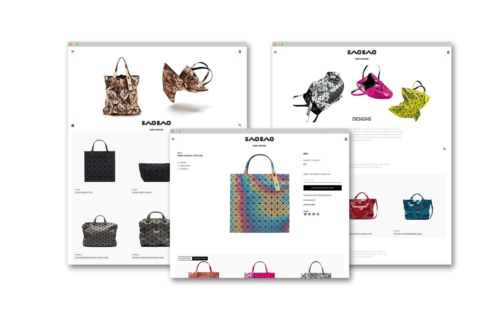
BAO BAO ISSEY MIYAKE
UI, UX, QA
—
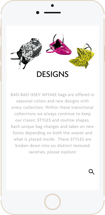
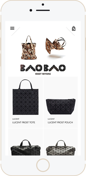
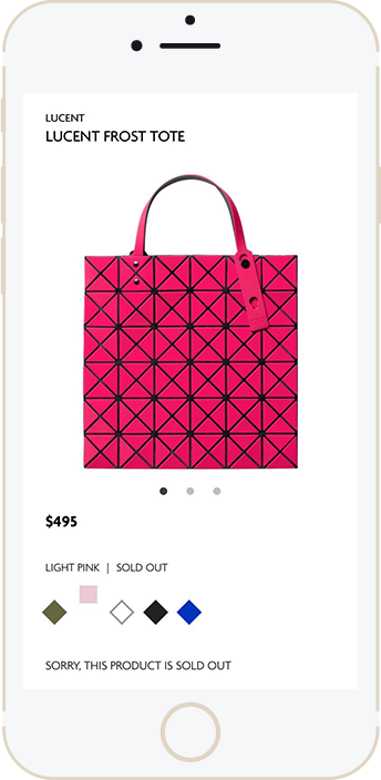
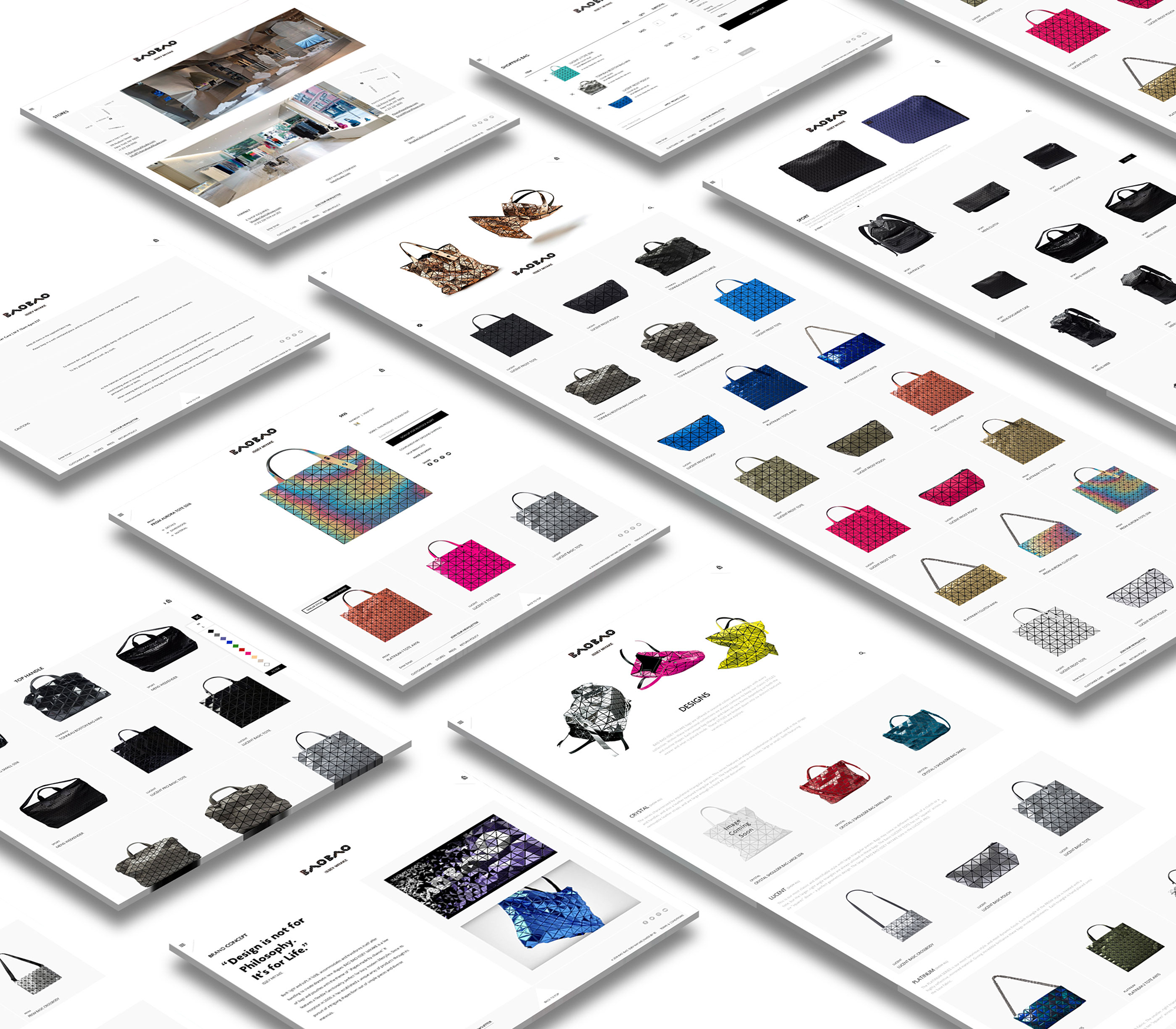
Our client Bao Bao Issey Miyake needed a website for their United States eCommerce platform, but not one that would compete with their original Japanese website. I collaborated with the Creative Director to work on the UI, and focused on designing and refining UX and Interaction Design elements. During the development process, I worked closely with the Engineering team to help facilitate a smooth transition from design mocks to code by providing clear and detailed bug tickets via Pivotal Tracker and working alongside Development to improve the overall user experience.

COLOR SORT & PRODUCT FILTER
–
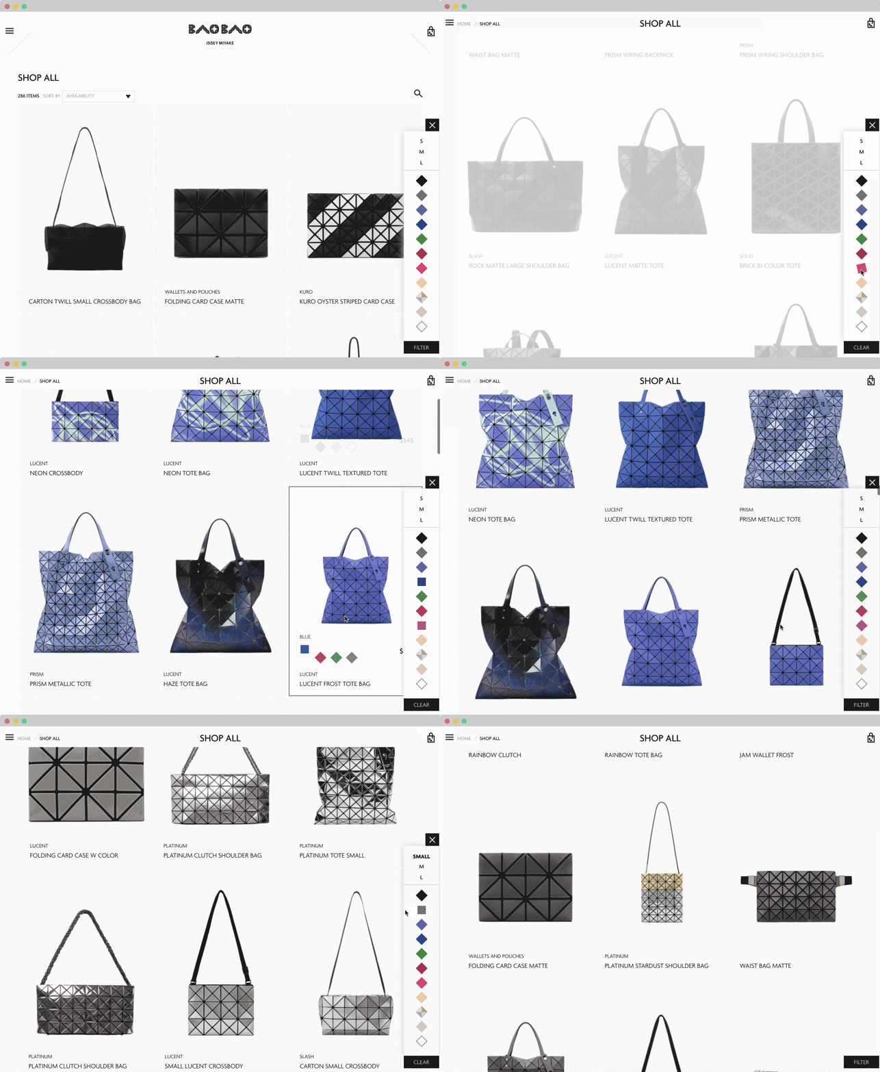
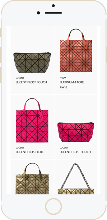
All items are automatically sorted by color, creating a rainbow gradient when entering the page. The product filter floats in the right hand rail, out of the products way but available when needed, providing the user with live results.
