MAD LIBS
UI, UX, QA
—
Penguin Random House needed a website that accurately represented their brand Mad Libs - The World's Greatest Word Game - and invited the users to play. The current design wasn't responsive, lacked organized categories, was difficult to navigate through the massive library, and didn't represent the sense of play the brand inspires and creates. Our team did a total overhaul of the sites design, branding, and taxonomy to appeal to an audience that was 13 and over while encouraging gameplay.
GAMEPLAY DESIGN
The goal of the redesign was to create gameplay with the audience, inviting them to play a piece of Mad Libs with the ability to share their Mad Libs story on social media, engaging their friends in the same gameplay and driving traffic back to the site.
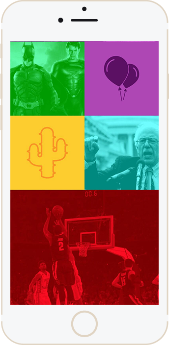
By using current topics like politics, movies, televisions, sports, and memes, this will excite users of all ages to click on the Libs that are relevant to them, increasing the chances of them sharing the content.
LANDING PAGE
–
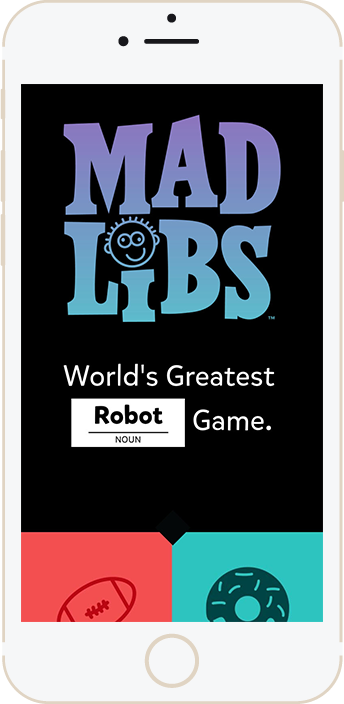
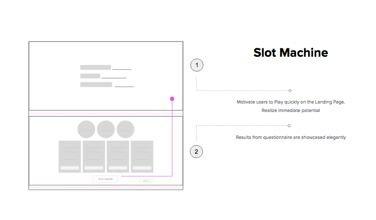
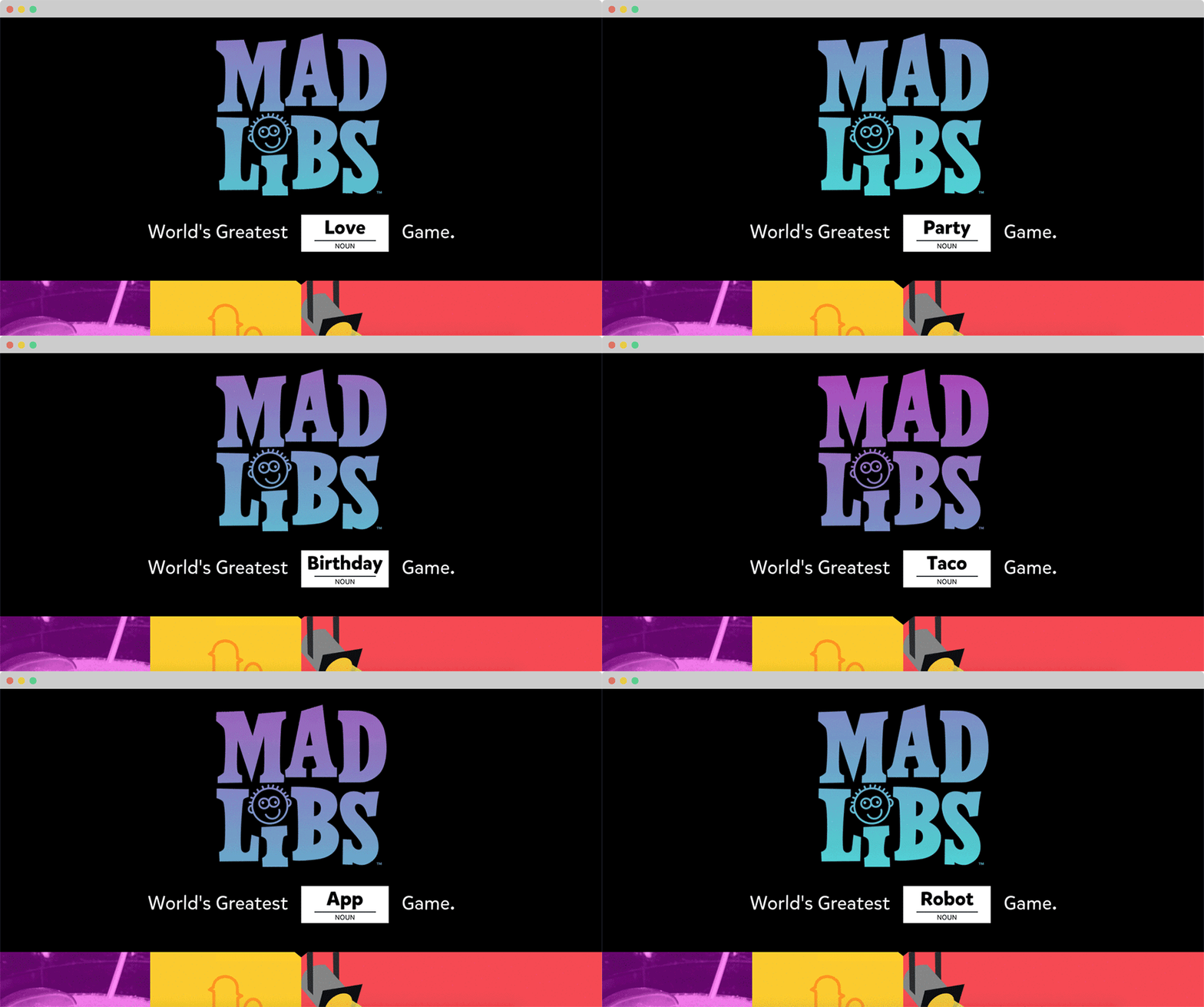
We wanted to re-familiarize a well known name like Mad Libs with their audience by introducing the new home page with the updated branding and an animation that illustrates how the game is played.
HOME PAGE
–
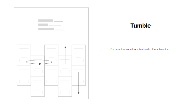
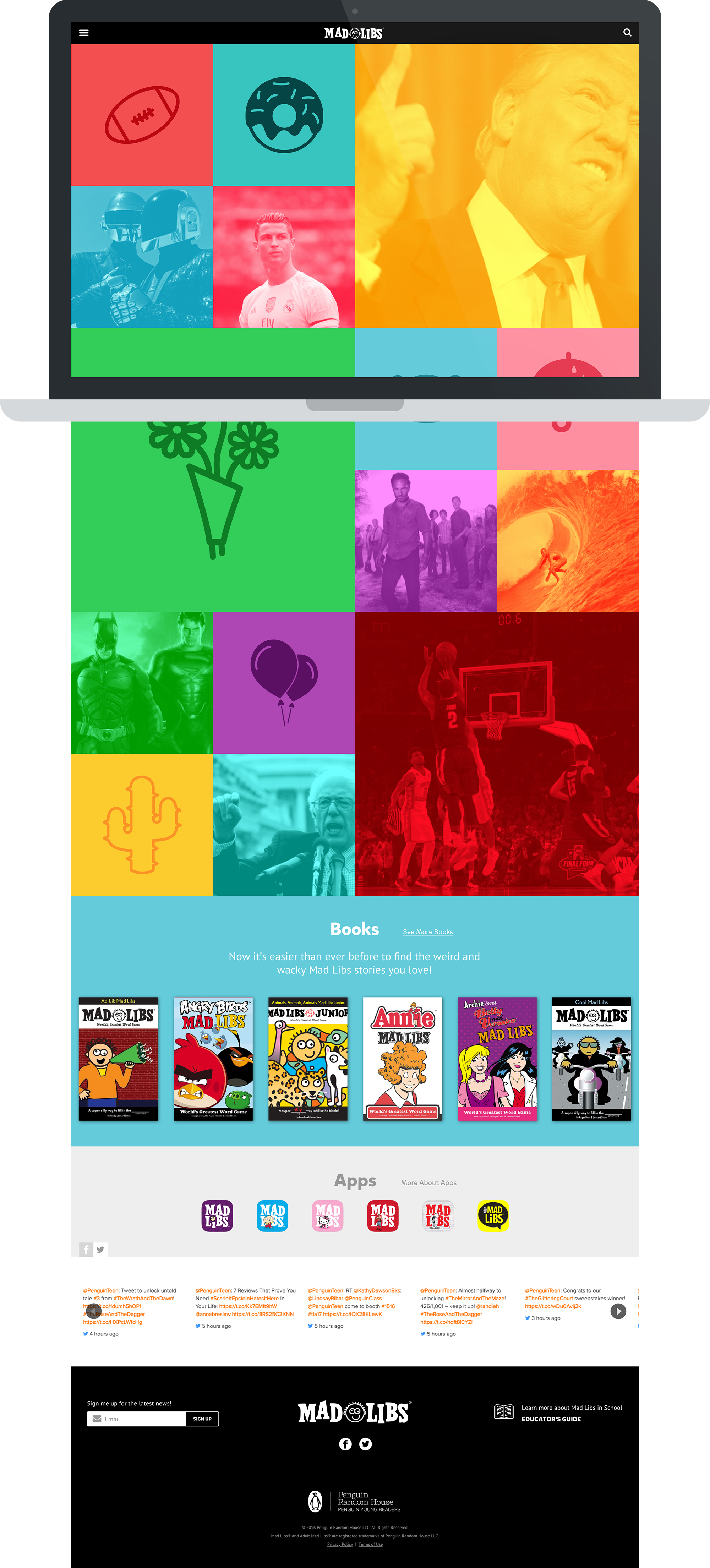
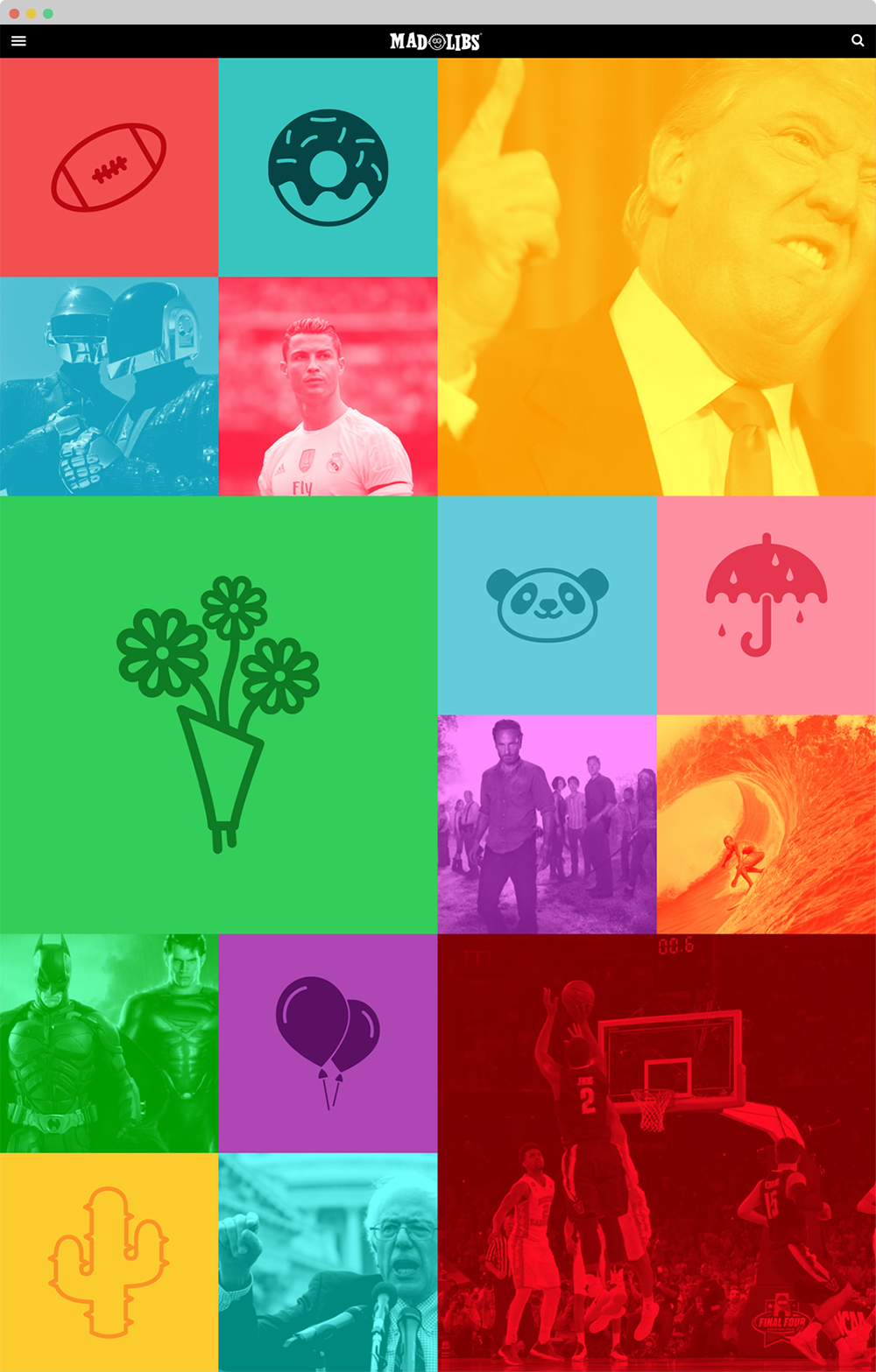
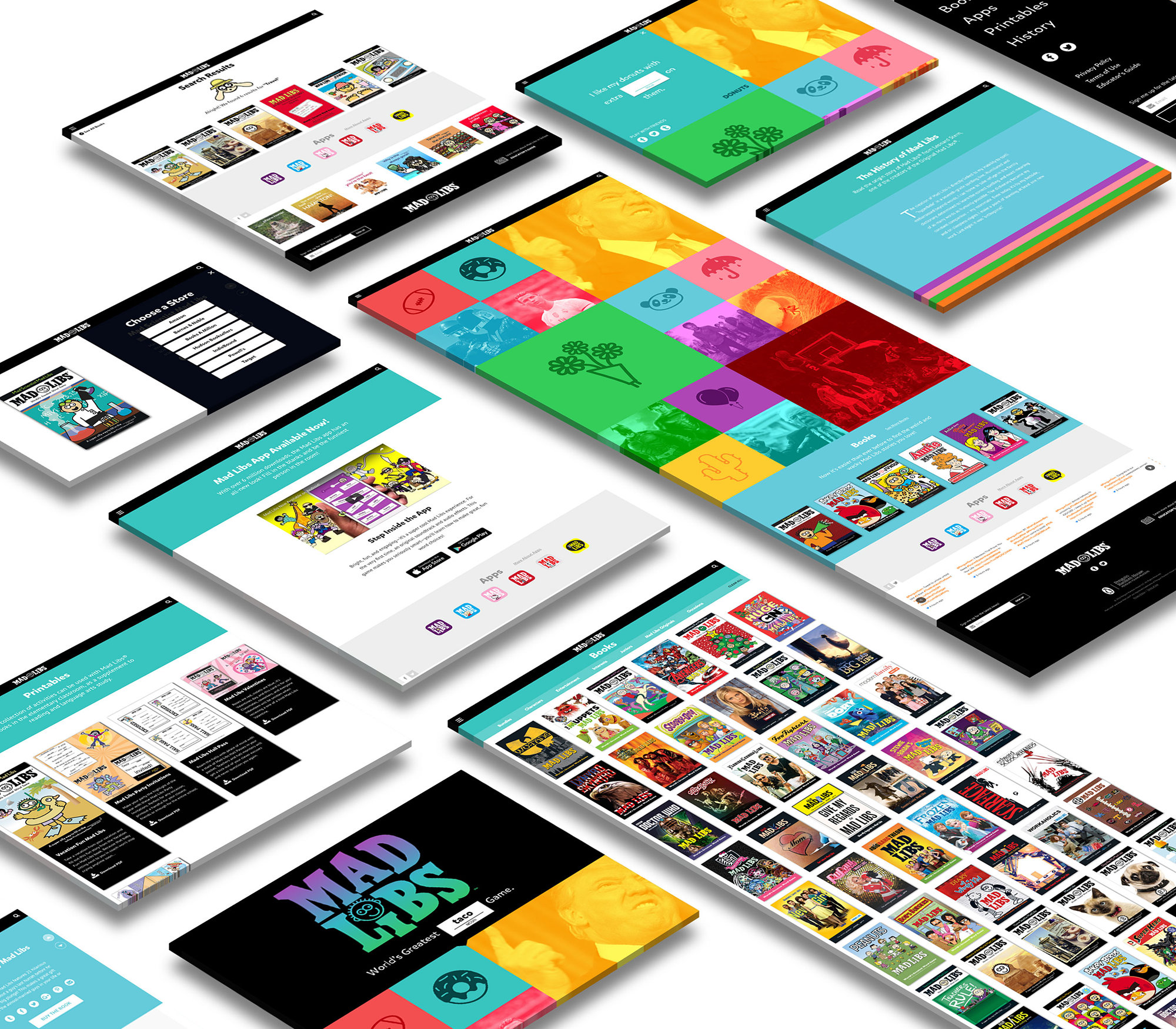
As a part of initiating gameplay, we wanted to immediately invite to user to explore. With delightful visual use of branded color and the variety of topics, users of all ages and interests have Libs to click on. And by updating the topics on a daily basis, users are give fresh content with incentive to come back often and continue to play and share.
TILE EXPANSION
–
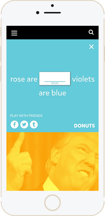
On click, each tile expands to reveal a Mad Libs sentence. The user can then share this Mad Libs via their social media accounts, where they can interact and play with friends.
In addition to playing the game, each tile provides a category topic which links to the ecommerce section of the site, driving sales to relevant books.

*Originally, we wanted the user to be able to input their own word into the sentence and share their completed game with friends. But the Mad Libs team wanted the social share aspect to focus on starting a conversation with friends vs just simply sharing a funny picture. We also faced the legal restriction of sharing branded material that could have potentially offensive or inappropriate suggestions.
BOOKS PAGE
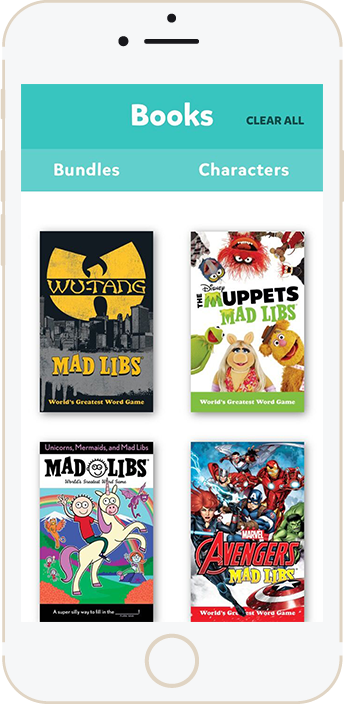
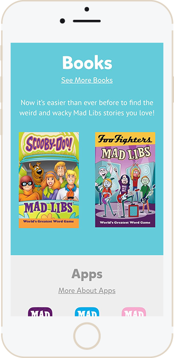
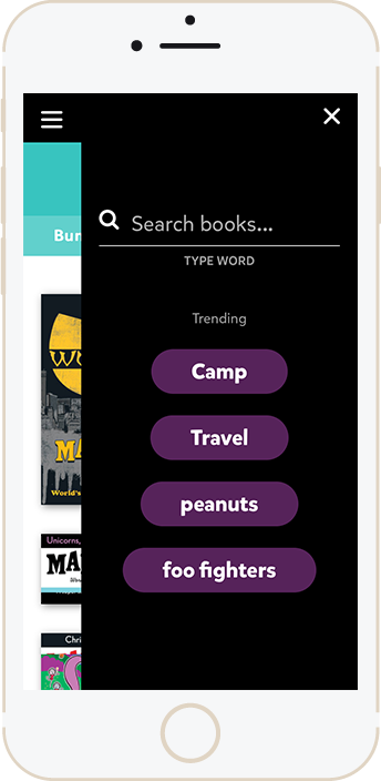
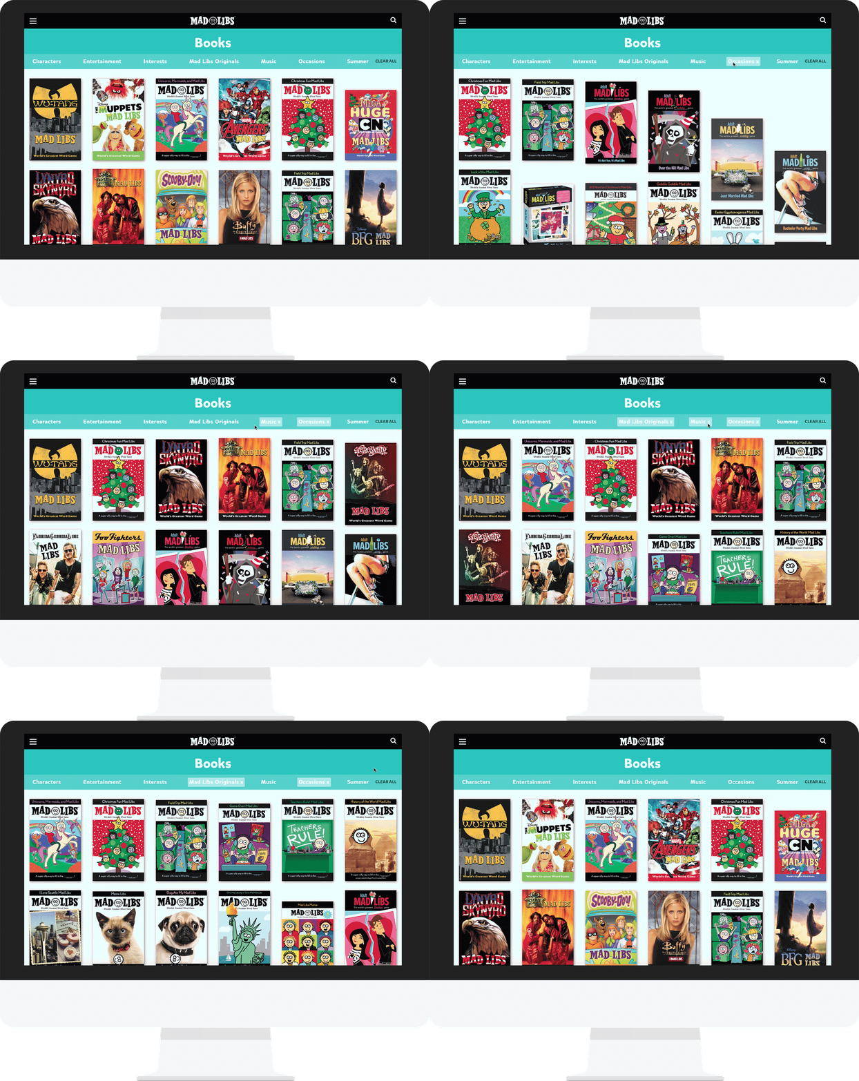
Although Penguin Random House didn’t consider the Mad Libs website to be an ecommerce site, our team felt strongly that we could still incorporate ways to drive sales via their books page. We wanted to emphasize the interactions throughout the website to enhance the gameplay experience of the homepage. By detailing the interactions of how the user searches for books, applies filters, and receives results, we made the shopping experience easier and entertaining for the user, resulting in more sales.
FILTERS
–
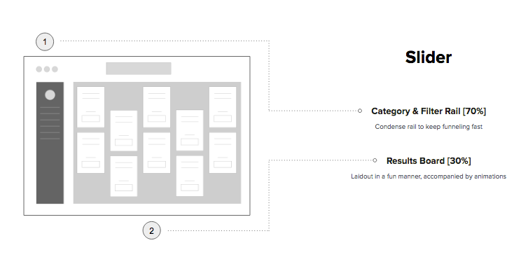
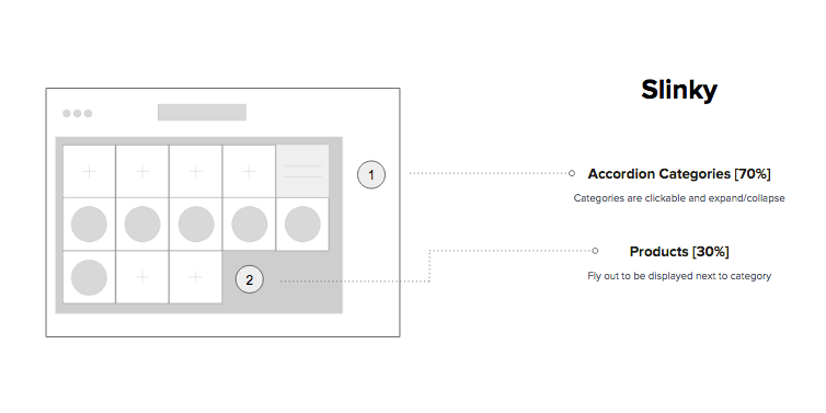
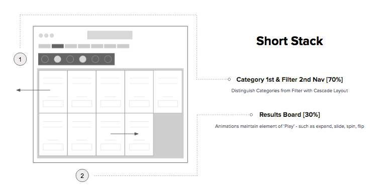
In addition to reducing their book categories from 55 to 7 to increase ease of search, we also experimented ways to incorporate gameplay into the filtering experience. By making something as simple as filtering a fun experience, it makes the discoverability of their wide breadth of book titles a game in itself.
RESULT INTERACTION
–
After a user applies a filter, why should the gameplay end there? We also experimented with fun and interesting ways to bring gameplay to the search results interaction.
PRODUCT PAGE
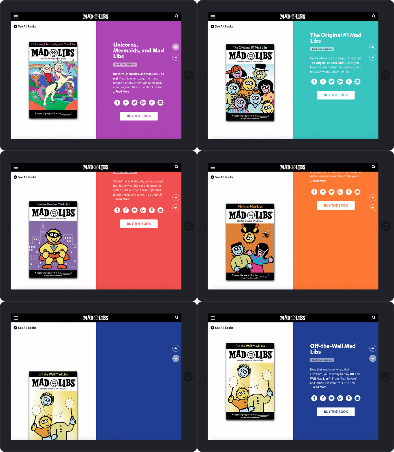
After the user has navigated and discovered book titles via the books page, they land on the product page and are able to explore related titles with vertical swiping. This interaction reiterates the theme of gameplay experienced throughout the site.

RESPONSIVENESS
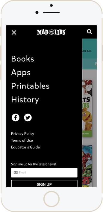
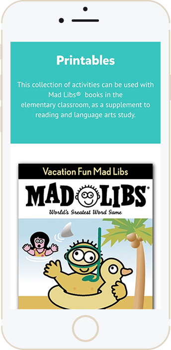
As the website hadn't been updated in almost a decade, our redesign also focused on creating a resposive experience that could be enjoyed across all devices and platforms. This cross-platform functionality incorporates interactions for hand held devices defining unique and memorable experiences for every user, regardless of how they view the site.
