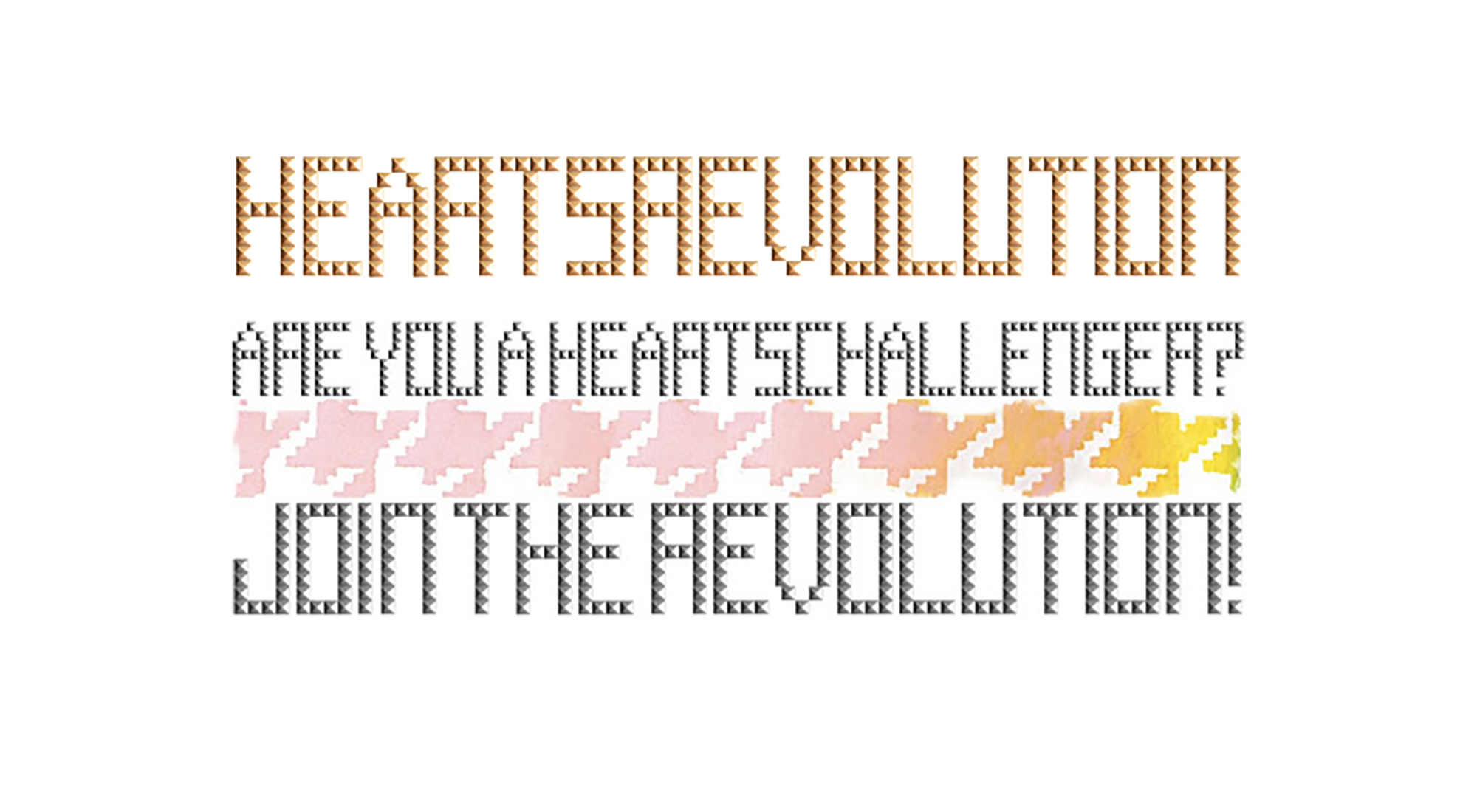
STUD FONT
⟡⟡⟡⟡⟡
Heartsrevolution is a synth pop electronic duo who started creating music together in 2005. They had already established a strong visual identity for themselves, but needed some refinement in order to expand and scale their brand.
When I met them in 2009 I started working with them as their designer. Together we took the visual elements that drove their identity and found ways to improve them. First up was their “stud font” logo.
The artists had created their logo by scanning metal studs to spell out their name. This embodied their punk DIY values, but as their brand expanded, it made it difficult to use for web and print projects. After years of being tweaked, adjusted, scanned, and copied the graphic became degraded beyond further use.
I digitized the original logo by recreating the scanned stud as a vector illustration. I then used the vector stud to construct a full alphabet, including numbers, and characters. This allowed me not only to recreate the logo in a scalable vector format, but also create other words for graphics and design elements. The updated logo could then be used for large scale printing projects and hi resolution web design screens.
CLIENT: HEARTSREVOLUTION
AGENCY: SELF
TASK: TYPOGRAPHY, GRAPHIC DESIGN
DATE OF WORK: 2009
CLIENT: HEARTSREVOLUTION
AGENCY: SELF
TASK: TYPOGRAPHY, GRAPHIC DESIGN
DATE OF WORK: 2009
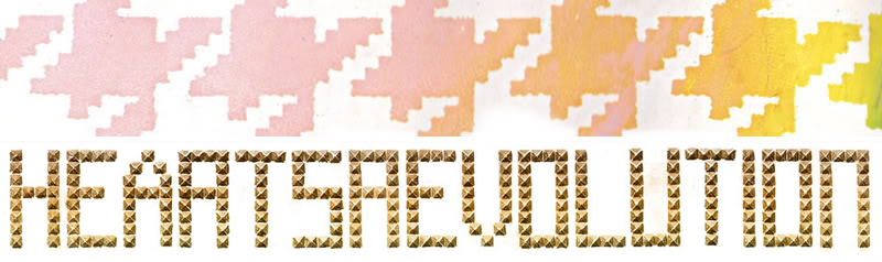
The original design using a single stud scan to spell out HEARTSREVOLUTION.
The original design using a single stud scan to spell out HEARTSREVOLUTION.
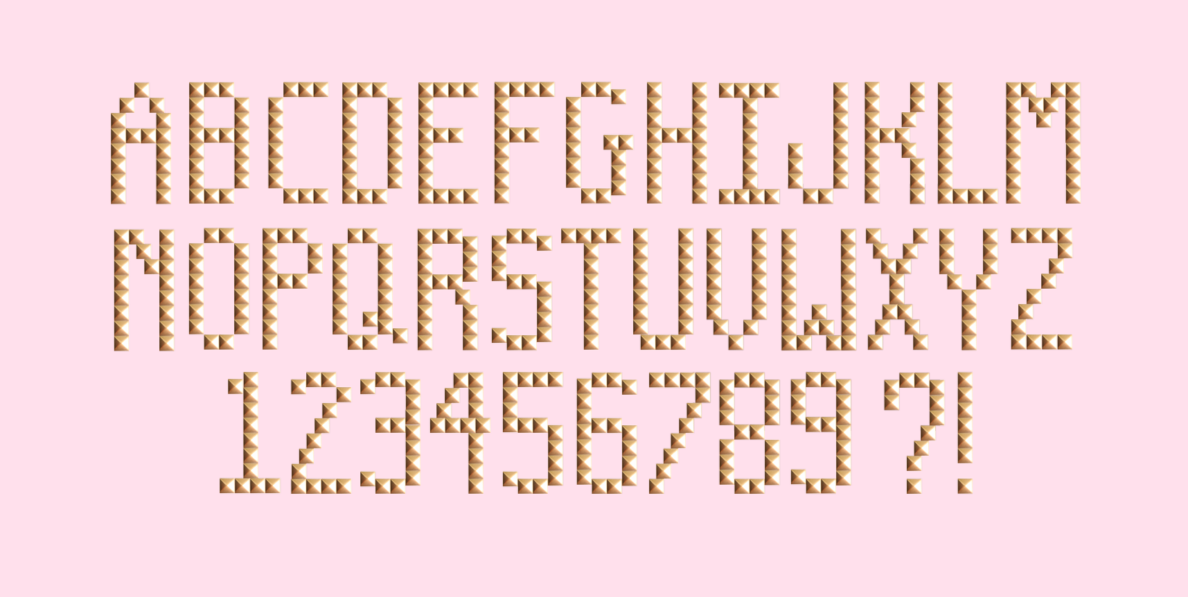
The new, fully vectorized character set.
The new, fully vectorized character set.